Carousel
Photos you drag, flick, sweep or arrow through: a row with depth, a fanned hand, a rising diagonal, a spiral, a column that warps at the edges, thumbnails over a full-bleed photo, and a pager that counts down in each photo's colour.
Depth
Photos in a row. The one in focus stands tall in the middle while its neighbours turn away and bunch up toward the edges.
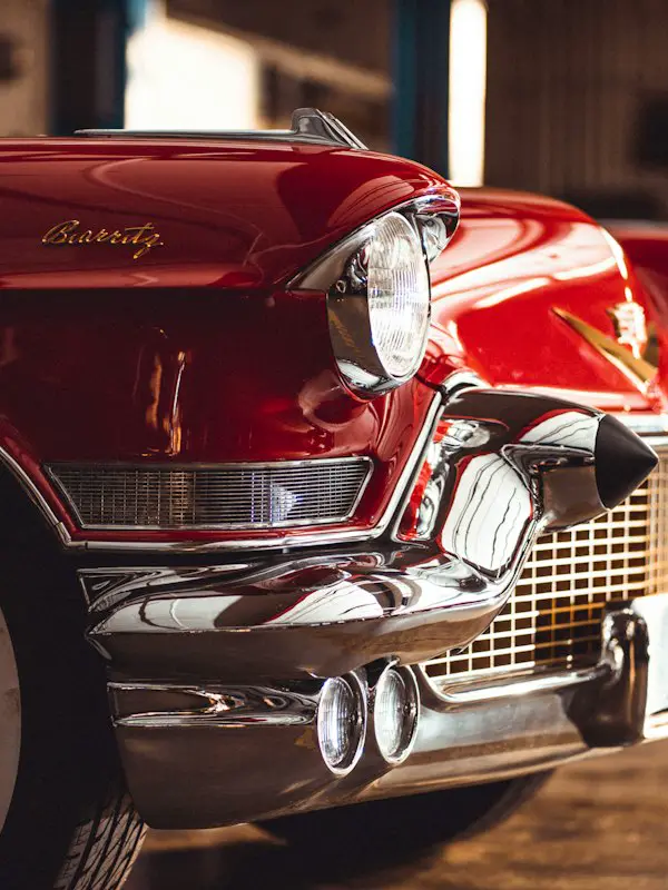
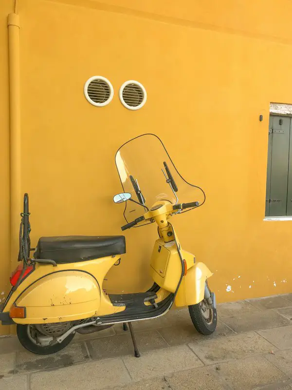
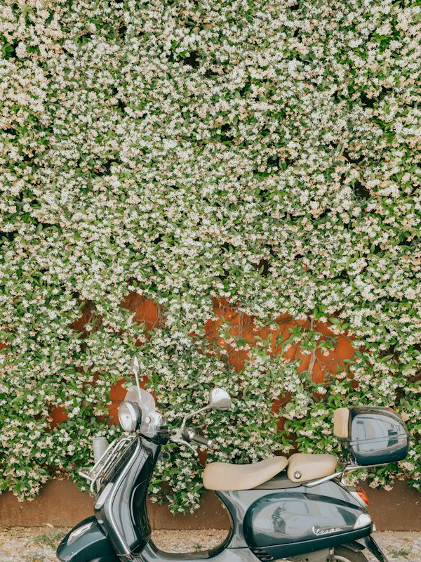
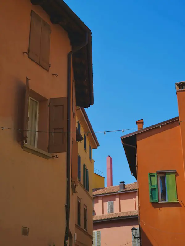
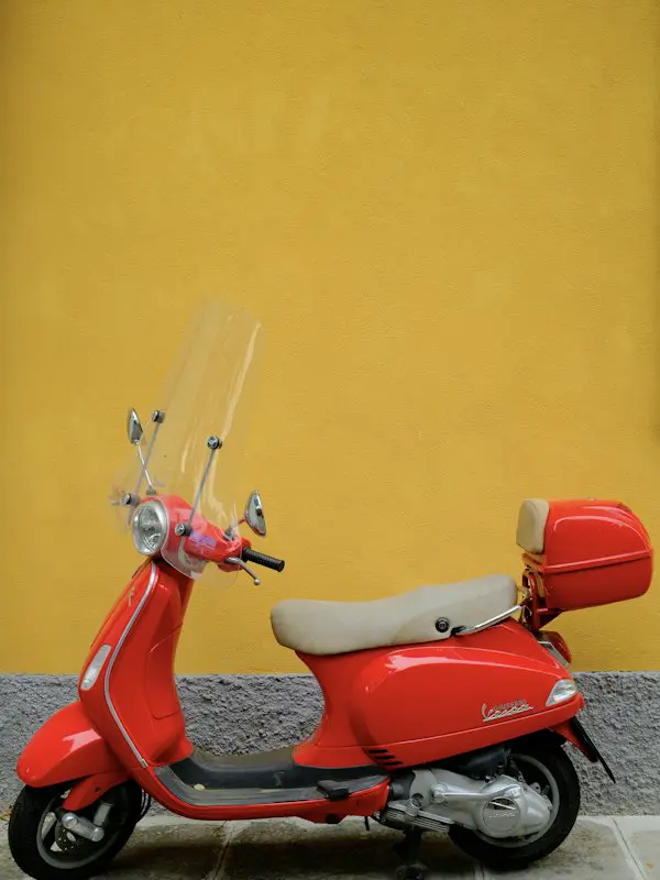
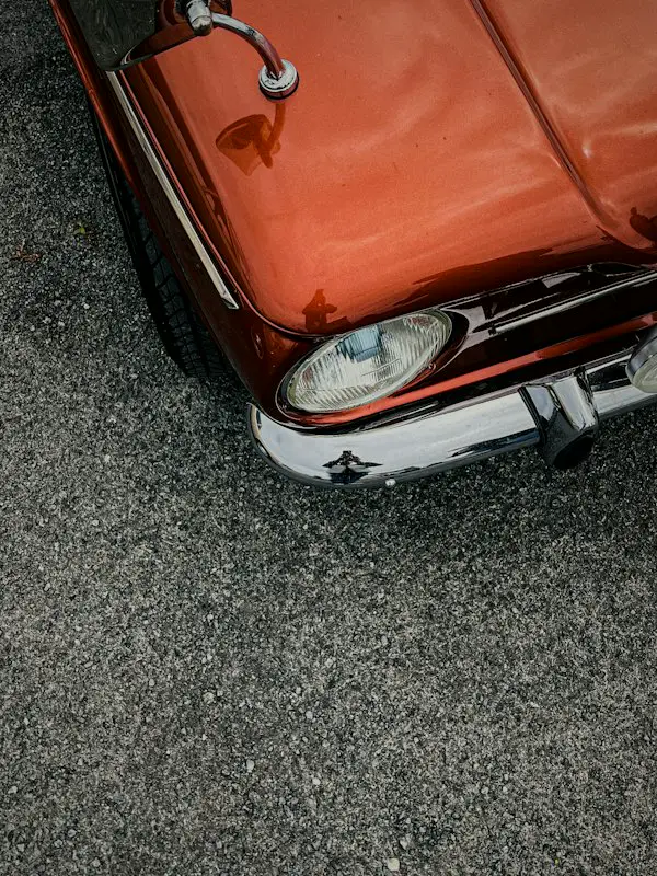
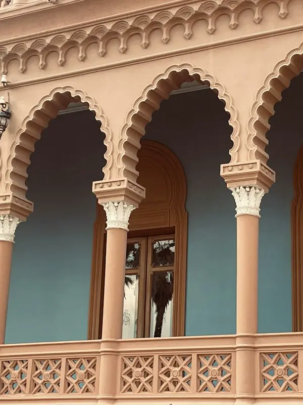
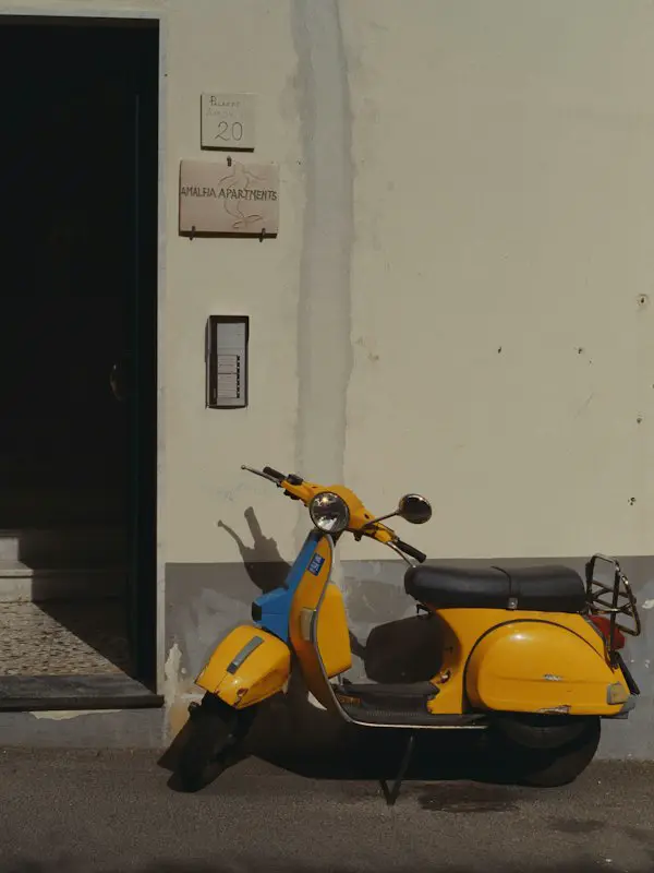
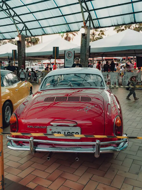
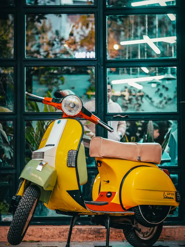
1 / 12
Installation
$npx shadcn@latest add @stillui/carouselOr copy the source into your project. It needs the shadcn color tokens and the cn helper.
"use client";
// stillui.dev/components/carousel

import { animate, motion, useMotionValue, useReducedMotion, useTransform, type MotionValue, type PanInfo } from "motion/react";
import { useCallback, useEffect, useId, useLayoutEffect, useRef, useState, type KeyboardEvent } from "react";
import { cn } from "@/lib/utils";

// Settles on a slide without bouncing past it.
const SETTLE = { type: "spring", stiffness: 260, damping: 34, mass: 0.9 } as const;

export type CarouselItem = { src: string; alt: string };

type CarouselProps = {
  items: CarouselItem[];
  /** Width of the card in focus, in pixels. Shrinks to fit narrow containers. */
  cardWidth?: number;
  defaultIndex?: number;
  index?: number;
  onIndexChange?: (index: number) => void;
  /** Moves to the next card every this many milliseconds. Pauses while hovered, focused or dragged. */
  autoPlay?: number;
  /** Shows previous and next buttons with a count under the cards. */
  controls?: boolean;
  label?: string;
  className?: string;
};

/** Where a card sits when it is `d` places from the one in focus (negative: before it). */
type Place = { x: number; y: number; scale: number; rotate: number; rotateY: number; opacity: number };

// The focused card is full size; neighbours shrink, turn slightly away, and close up as they go.
function layout(d: number, w: number): Place {
  const a = Math.abs(d);
  const near = Math.min(a, 1);
  const far = Math.max(a - 1, 0);
  const x = Math.sign(d) * w * (0.86 * near + 0.42 * far - 0.035 * far * far);
  const scale = Math.max(0.5, 1 - 0.22 * near - 0.05 * far);
  return { x, y: 0, scale, rotate: 0, rotateY: -Math.sign(d) * 16 * near, opacity: a > 4.5 ? 0 : Math.min(1, 4.5 - a) };
}

/**
 * Photos in a row. The one in focus stands tall in the middle while its neighbours turn away and bunch up toward the edges.
 */
export function Carousel({
  items,
  cardWidth = 220,
  defaultIndex = 0,
  index,
  onIndexChange,
  autoPlay,
  controls = true,
  label = "Photos",
  className,
}: CarouselProps) {
  const reduce = useReducedMotion() ?? false;
  const ids = useId();
  const count = items.length;
  const stageRef = useRef<HTMLDivElement>(null);
  const [width, setWidth] = useState(cardWidth);
  const [internal, setInternal] = useState(defaultIndex);
  const current = index ?? internal;
  const [paused, setPaused] = useState(false);

  // One continuous position drives every card: 2.5 means halfway between the third and fourth.
  const position = useMotionValue(current);
  const target = useRef(current);
  const dragStart = useRef(0);
  const dragged = useRef(false);

  // The card shrinks with its container, so the layout keeps its shape on phones.
  useLayoutEffect(() => {
    const stage = stageRef.current;
    if (!stage) return;
    const measure = () => setWidth(Math.min(cardWidth, stage.offsetWidth * 0.42));
    measure();
    const observer = new ResizeObserver(measure);
    observer.observe(stage);
    return () => observer.disconnect();
  }, [cardWidth]);

  const settle = useCallback(
    (to: number) => {
      target.current = Math.round(to);
      const next = ((target.current % count) + count) % count;
      if (reduce) position.set(target.current);
      else animate(position, target.current, SETTLE);
      if (index === undefined) setInternal(next);
      onIndexChange?.(next);
    },
    [count, reduce, position, index, onIndexChange],
  );

  // A controlled index set from outside: travel there the shortest way round.
  useEffect(() => {
    if (((target.current % count) + count) % count === current) return;
    target.current += Math.round(wrap(current - target.current, count));
    if (reduce) position.set(target.current);
    else animate(position, target.current, SETTLE);
  }, [current, count, position, reduce]);

  const step = (by: number) => settle(target.current + by);

  useEffect(() => {
    if (!autoPlay || paused || reduce) return;
    const timer = window.setInterval(() => settle(target.current + 1), autoPlay);
    return () => window.clearInterval(timer);
  }, [autoPlay, paused, reduce, settle]);

  // Sideways scrolling (trackpads, shift+wheel) moves through the cards; up and down still scroll the page.
  useEffect(() => {
    const stage = stageRef.current;
    if (!stage) return;
    let timer: number | undefined;
    const onWheel = (event: WheelEvent) => {
      if (Math.abs(event.deltaX) <= Math.abs(event.deltaY)) return;
      event.preventDefault();
      position.stop();
      position.set(position.get() + event.deltaX / (width * 0.62));
      window.clearTimeout(timer);
      timer = window.setTimeout(() => settle(position.get()), 120);
    };
    stage.addEventListener("wheel", onWheel, { passive: false });
    return () => {
      stage.removeEventListener("wheel", onWheel);
      window.clearTimeout(timer);
    };
  }, [position, settle, width]);

  const onPanStart = () => {
    position.stop();
    dragStart.current = position.get();
    dragged.current = true;
    setPaused(true);
  };
  const onPan = (_: PointerEvent, info: PanInfo) => position.set(dragStart.current - info.offset.x / (width * 0.62));
  const onPanEnd = (_: PointerEvent, info: PanInfo) => {
    // A flick carries on a little, in the direction it was thrown, but never more than three cards.
    const carry = (info.velocity.x / (width * 0.62)) * 0.18;
    settle(position.get() - Math.max(-3, Math.min(3, carry)));
    setPaused(false);
  };

  const onKeyDown = (event: KeyboardEvent) => {
    if (event.key === "ArrowRight" || event.key === "ArrowDown") step(1);
    else if (event.key === "ArrowLeft" || event.key === "ArrowUp") step(-1);
    else return;
    event.preventDefault();
  };

  return (
    <div
      role="region"
      aria-roledescription="carousel"
      aria-label={label}
      className={cn("grid gap-4", className)}
      onPointerEnter={() => setPaused(true)}
      onPointerLeave={() => setPaused(false)}
      onFocus={() => setPaused(true)}
      onBlur={() => setPaused(false)}
    >
      <motion.div
        ref={stageRef}
        tabIndex={0}
        onKeyDown={onKeyDown}
        onPointerDown={() => (dragged.current = false)}
        onPanStart={onPanStart}
        onPan={onPan}
        onPanEnd={onPanEnd}
        aria-describedby={`${ids}-hint`}
        className="relative w-full cursor-grab touch-pan-y select-none overflow-hidden rounded-2xl outline-none active:cursor-grabbing focus-visible:ring-2 focus-visible:ring-ring"
        style={{ height: width * 1.6 }}
      >
        <span id={`${ids}-hint`} className="sr-only">
          Use the arrow keys or drag to move between photos.
        </span>
        {items.map((item, i) => (
          <Card
            key={item.src}
            item={item}
            i={i}
            count={count}
            width={width}
            position={position}
            current={i === current}
            onSelect={() => {
              // The click that ends a drag isn't a choice of card.
              if (dragged.current) return;
              settle(target.current + Math.round(wrap(i - target.current, count)));
            }}
          />
        ))}
      </motion.div>

      {controls ? (
        <div className="flex items-center justify-center gap-3">
          <Arrow direction={-1} onClick={() => step(-1)} />
          <p aria-live="polite" className="min-w-14 text-center text-sm tabular-nums text-muted-foreground">
            {current + 1} / {count}
          </p>
          <Arrow direction={1} onClick={() => step(1)} />
        </div>
      ) : null}
    </div>
  );
}

/** Rounds for the transform string, so server and browser write the same numbers. */
function r(value: number, precision = 100) {
  return Math.round(value * precision) / precision;
}

/** The signed distance from a to b round a loop of n, between -n/2 and n/2. */
function wrap(d: number, n: number) {
  return ((((d + n / 2) % n) + n) % n) - n / 2;
}

type CardProps = {
  item: CarouselItem;
  i: number;
  count: number;
  width: number;
  position: MotionValue<number>;
  current: boolean;
  onSelect: () => void;
};

function Card({ item, i, count, width, position, current, onSelect }: CardProps) {
  const place = (p: number) => layout(wrap(i - p, count), width);
  const transform = useTransform(position, (p) => {
    const { x, y, scale, rotate, rotateY } = place(p);
    return `translate(-50%, -50%) translate3d(${r(x)}px, ${r(y)}px, 0) perspective(${r(width * 6)}px) rotateY(${r(rotateY)}deg) rotate(${r(rotate)}deg) scale(${r(scale, 1000)})`;
  });
  const opacity = useTransform(position, (p) => r(place(p).opacity));
  const zIndex = useTransform(position, (p) => Math.round(1000 - Math.abs(wrap(i - p, count)) * 10));
  const visibility = useTransform(opacity, (o) => (o < 0.01 ? "hidden" : "visible"));

  return (
    <motion.div
      role="group"
      aria-roledescription="slide"
      aria-label={`${i + 1} of ${count}`}
      aria-hidden={!current}
      onClick={current ? undefined : onSelect}
      className="absolute left-1/2 top-1/2 overflow-hidden rounded-xl bg-muted shadow-overlay will-change-transform"
      style={{ width, aspectRatio: "3 / 4", transform, opacity, zIndex, visibility }}
    >
      {/* A plain img keeps the component free of Next.js; pass already-sized images. */}
      {/* eslint-disable-next-line @next/next/no-img-element */}
      <img src={item.src} alt={item.alt} draggable={false} loading="lazy" decoding="async" className="pointer-events-none size-full object-cover" />
    </motion.div>
  );
}

function Arrow({ direction, onClick }: { direction: 1 | -1; onClick: () => void }) {
  return (
    <button
      type="button"
      onClick={onClick}
      aria-label={direction === 1 ? "Next photo" : "Previous photo"}
      className="grid size-9 place-items-center rounded-full text-muted-foreground transition-[color,background-color,scale] hover:bg-secondary hover:text-foreground active:scale-[0.92]"
    >
      <svg viewBox="0 0 16 16" fill="none" stroke="currentColor" strokeWidth="1.5" strokeLinecap="round" strokeLinejoin="round" className="size-4" aria-hidden>
        <path d={direction === 1 ? "M6 3.5L10.5 8 6 12.5" : "M10 3.5L5.5 8 10 12.5"} />
      </svg>
    </button>
  );
}
States
- In focus
- The middle card is full size and faces you. Tap any other card to bring it to the middle.
- Neighbours
- Each step away is smaller, turned a little further, and closer to the next, so many fit in a narrow space.
- Drag and flick
- Cards follow the pointer, then settle on the nearest one. A quick flick carries a little further.
- Keyboard
- The stage takes focus; the arrow keys move one card. The count is announced as it changes.
- Scroll
- Sideways scrolling on a trackpad moves through the cards. Scrolling up and down still scrolls the page.
- Loop
- The last card leads back to the first, always the shortest way round.
- Autoplay
- Off by default. Pass autoPlay in milliseconds; it pauses while hovered, focused or dragged.
- Narrow screens
- Cards shrink with the container so the shape holds on a phone.
- Reduced motion
- Cards jump to their places, and autoplay stays off.
Notes
Images fill a 3:4 card with object-fit cover. Use photos at least twice the card width for sharp screens.
Fan
Photos fanned out like a hand of cards. Each one leans with the arc, and the hand slides round as you move.
1 / 12
Installation
$npx shadcn@latest add @stillui-pro/carousel-fanA paid component. The command needs the token from your account in STILLUI_TOKEN; your account page shows the one-time setup.
This is a paid component. Its source and install come with access.
States
- In focus
- The top card of the arc stands upright. Tap any other card to bring it up.
- The hand
- Cards follow one wide arc, leaning further the further out they are.
- Drag and flick
- Cards follow the pointer, then settle on the nearest one. A quick flick carries a little further.
- Keyboard
- The stage takes focus; the arrow keys move one card. The count is announced as it changes.
- Scroll
- Sideways scrolling on a trackpad moves through the cards. Scrolling up and down still scrolls the page.
- Loop
- The last card leads back to the first, always the shortest way round.
- Autoplay
- Off by default. Pass autoPlay in milliseconds; it pauses while hovered, focused or dragged.
- Narrow screens
- Cards shrink with the container so the shape holds on a phone.
- Reduced motion
- Cards jump to their places, and autoplay stays off.
Notes
Images fill a 3:4 card with object-fit cover. Use photos at least twice the card width for sharp screens.
Stairs
Photos climbing a diagonal. The one in focus is largest, and the rest step down and away toward each corner.
1 / 12
Installation
$npx shadcn@latest add @stillui-pro/carousel-stairsA paid component. The command needs the token from your account in STILLUI_TOKEN; your account page shows the one-time setup.
This is a paid component. Its source and install come with access.
States
- In focus
- The middle of the diagonal holds the largest card. Tap any other card to bring it there.
- The steps
- Cards shrink and close up as they climb, so the line reads as depth.
- Drag and flick
- Cards follow the pointer, then settle on the nearest one. A quick flick carries a little further.
- Keyboard
- The stage takes focus; the arrow keys move one card. The count is announced as it changes.
- Scroll
- Sideways scrolling on a trackpad moves through the cards. Scrolling up and down still scrolls the page.
- Loop
- The last card leads back to the first, always the shortest way round.
- Autoplay
- Off by default. Pass autoPlay in milliseconds; it pauses while hovered, focused or dragged.
- Narrow screens
- Cards shrink with the container so the shape holds on a phone.
- Reduced motion
- Cards jump to their places, and autoplay stays off.
Notes
Images fill a 3:4 card with object-fit cover. Use photos at least twice the card width for sharp screens.
Spiral
Photos winding into a spiral. The one in focus sits large in front; the rest curl away behind it, smaller with every turn.
1 / 12
Installation
$npx shadcn@latest add @stillui-pro/carousel-spiralA paid component. The command needs the token from your account in STILLUI_TOKEN; your account page shows the one-time setup.
This is a paid component. Its source and install come with access.
States
- In focus
- The front card sits large at the bottom of the spiral. Tap any card in the trail to bring it forward.
- The trail
- Each card further back is smaller and turned with the curve. The last ones fade before the loop brings them round.
- Drag and flick
- Cards follow the pointer, then settle on the nearest one. A quick flick carries a little further.
- Keyboard
- The stage takes focus; the arrow keys move one card. The count is announced as it changes.
- Scroll
- Sideways scrolling on a trackpad moves through the cards. Scrolling up and down still scrolls the page.
- Loop
- The last card leads back to the first, always the shortest way round.
- Autoplay
- Off by default. Pass autoPlay in milliseconds; it pauses while hovered, focused or dragged.
- Narrow screens
- Cards shrink with the container so the shape holds on a phone.
- Reduced motion
- Cards jump to their places, and autoplay stays off.
Notes
Images fill a 3:4 card with object-fit cover. Use photos at least twice the card width for sharp screens.
Warp
Photos in a column of pills. The one in focus sits sharp in the middle; cards stretch, flare and split into colour as they slide off the top and bottom.
1 / 12
Installation
$npx shadcn@latest add @stillui-pro/carousel-warpA paid component. The command needs the token from your account in STILLUI_TOKEN; your account page shows the one-time setup.
This is a paid component. Its source and install come with access.
States
- In focus
- The middle card is drawn as it is. Tap a card above or below to bring it to the middle.
- The edges
- Near the top and bottom, rows of each card are pulled out into streaks, the shape widens, and red and blue drift apart.
- Drag and flick
- Cards follow the pointer up and down, then settle on the nearest one. A quick flick carries a little further.
- Keyboard
- The stage takes focus; the arrow keys move one card. The count is announced as it changes.
- Scroll
- Once the column has focus, scrolling moves through the cards. Before that, the page scrolls past it.
- Loop
- The last card leads back to the first, always the shortest way round.
- Autoplay
- Off by default. Pass autoPlay in milliseconds; it pauses while hovered, focused or dragged.
- Without WebGL
- Plain pill cards move the same way, with no warp. They also show while the photos load.
- Reduced motion
- Cards jump to their places, and autoplay stays off.
Notes
The warp is a WebGL shader, with no extra library. Photos are packed into one texture when the component mounts.
Photos from another domain must send CORS headers to be drawn in WebGL; without them the plain cards stay.
Images fill a 3:4 pill with object-fit cover.
Backdrop
A row of thumbnails over a full-bleed photo. Sweep across the row and the photo behind cuts to each one; the chosen thumbnail grows and its neighbours make room.
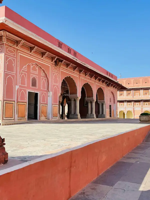
Installation
$npx shadcn@latest add @stillui/carousel-backdropOr copy the source into your project. It needs the shadcn color tokens and the cn helper.
"use client";
// stillui.dev/components/carousel#backdrop

import { motion, useReducedMotion } from "motion/react";
import { useCallback, useEffect, useLayoutEffect, useRef, useState, type KeyboardEvent } from "react";
import { cn } from "@/lib/utils";

// Quick enough to keep up with a pointer sweeping across the row.
const GROW = { type: "spring", stiffness: 520, damping: 38, mass: 0.6 } as const;
// How much bigger the chosen thumbnail gets.
const LIFT = 1.22;
const GAP = 6;

export type CarouselItem = { src: string; alt: string };

type CarouselBackdropProps = {
  items: CarouselItem[];
  /** Largest thumbnail width, in pixels. Shrinks so the whole row fits. */
  thumbWidth?: number;
  defaultIndex?: number;
  index?: number;
  onIndexChange?: (index: number) => void;
  /** Moves to the next photo every this many milliseconds. Pauses while hovered or focused. */
  autoPlay?: number;
  label?: string;
  className?: string;
};

/**
 * A row of thumbnails over a full-bleed photo. Sweep across the row and the photo behind cuts to each one; the chosen thumbnail grows and its neighbours make room.
 */
export function CarouselBackdrop({
  items,
  thumbWidth = 96,
  defaultIndex = 0,
  index,
  onIndexChange,
  autoPlay,
  label = "Photos",
  className,
}: CarouselBackdropProps) {
  const reduce = useReducedMotion() ?? false;
  const count = items.length;
  const stageRef = useRef<HTMLDivElement>(null);
  const thumbs = useRef<(HTMLButtonElement | null)[]>([]);
  const [width, setWidth] = useState(thumbWidth);
  const [internal, setInternal] = useState(defaultIndex);
  const current = index ?? internal;
  const [paused, setPaused] = useState(false);

  const choose = useCallback(
    (next: number) => {
      const wrapped = ((next % count) + count) % count;
      if (wrapped === current) return;
      if (index === undefined) setInternal(wrapped);
      onIndexChange?.(wrapped);
    },
    [count, current, index, onIndexChange],
  );

  // Thumbnails shrink until the whole row, chosen one included, fits across the photo.
  useLayoutEffect(() => {
    const stage = stageRef.current;
    if (!stage) return;
    const measure = () => {
      const room = stage.offsetWidth * 0.88 - GAP * (count - 1);
      setWidth(Math.min(thumbWidth, room / (count - 1 + LIFT)));
    };
    measure();
    const observer = new ResizeObserver(measure);
    observer.observe(stage);
    return () => observer.disconnect();
  }, [thumbWidth, count]);

  useEffect(() => {
    if (!autoPlay || paused || reduce) return;
    const timer = window.setInterval(() => choose(current + 1), autoPlay);
    return () => window.clearInterval(timer);
  }, [autoPlay, paused, reduce, current, choose]);

  // One tab stop for the row; the arrow keys walk it and the photo follows.
  const onKeyDown = (event: KeyboardEvent) => {
    const by = event.key === "ArrowRight" || event.key === "ArrowDown" ? 1 : event.key === "ArrowLeft" || event.key === "ArrowUp" ? -1 : 0;
    const to = event.key === "Home" ? 0 : event.key === "End" ? count - 1 : (current + by + count) % count;
    if (!by && event.key !== "Home" && event.key !== "End") return;
    event.preventDefault();
    choose(to);
    thumbs.current[to]?.focus();
  };

  return (
    <div
      ref={stageRef}
      role="region"
      aria-roledescription="carousel"
      aria-label={label}
      className={cn("relative isolate aspect-[4/5] w-full overflow-hidden rounded-2xl bg-muted", className)}
      onPointerEnter={() => setPaused(true)}
      onPointerLeave={() => setPaused(false)}
      onFocus={() => setPaused(true)}
      onBlur={() => setPaused(false)}
    >
      {/* Every photo is already loaded as a thumbnail, so the cut is instant. */}
      {items.map((item, i) => (
        // eslint-disable-next-line @next/next/no-img-element
        <img
          key={item.src}
          src={item.src}
          alt={i === current ? item.alt : ""}
          aria-hidden={i !== current}
          draggable={false}
          decoding="async"
          className={cn("absolute inset-0 -z-10 size-full object-cover", i === current ? "visible" : "invisible")}
        />
      ))}

      <div role="group" aria-label="Choose a photo" onKeyDown={onKeyDown} className="absolute inset-x-0 top-1/2 flex -translate-y-1/2 items-center justify-center" style={{ gap: GAP }}>
        {items.map((item, i) => {
          const chosen = i === current;
          const w = chosen ? width * LIFT : width;
          return (
            <motion.button
              key={item.src}
              ref={(node) => {
                thumbs.current[i] = node;
              }}
              type="button"
              tabIndex={chosen ? 0 : -1}
              aria-label={item.alt}
              aria-current={chosen}
              onPointerEnter={(event) => event.pointerType === "mouse" && choose(i)}
              onClick={() => choose(i)}
              initial={false}
              animate={{ width: w, height: w * 1.25 }}
              transition={reduce ? { duration: 0 } : GROW}
              className="shrink-0 overflow-hidden rounded-[3px] shadow-overlay outline-none focus-visible:ring-2 focus-visible:ring-ring focus-visible:ring-offset-2 focus-visible:ring-offset-black/40"
            >
              {/* eslint-disable-next-line @next/next/no-img-element */}
              <img src={item.src} alt="" draggable={false} decoding="async" className="pointer-events-none size-full object-cover" />
            </motion.button>
          );
        })}
      </div>
    </div>
  );
}
States
- Hover
- With a mouse, passing over a thumbnail chooses it, so sweeping the row flips through the photos.
- Chosen
- The chosen thumbnail grows by a fifth and the row spreads to fit it. The photo behind cuts with no fade.
- Touch
- A tap chooses a thumbnail. Nothing changes on a stray touch while scrolling.
- Keyboard
- The row is one tab stop. Arrow keys move along it, Home and End jump to the ends, and the photo follows.
- Screen readers
- Each thumbnail is a button named after its photo, and the chosen one is marked current.
- Autoplay
- Off by default. Pass autoPlay in milliseconds; it pauses while hovered or focused.
- Narrow screens
- Thumbnails shrink so the whole row always fits across the photo.
- Reduced motion
- Thumbnails change size at once, and autoplay stays off.
Notes
Thumbnails and the backdrop use the same image, so the backdrop is already loaded when it is chosen. Use photos large enough for the backdrop.
Works best with three to eight photos; with more, the thumbnails get small.
Pager
Photos with a pill-shaped pager under them. The active dot stretches into a bar that fills as it counts down, and the pager takes on each photo's colour.
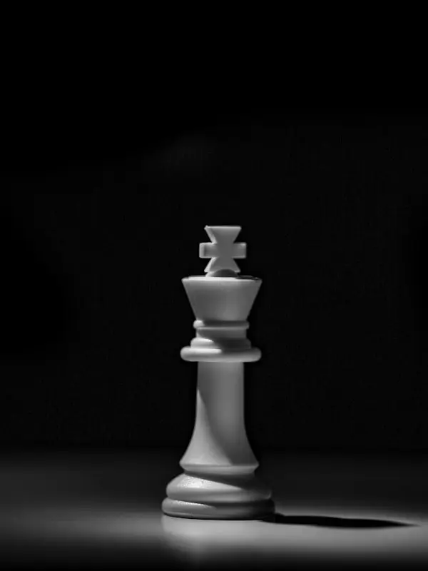
Installation
$npx shadcn@latest add @stillui/carousel-pagerOr copy the source into your project. It needs the shadcn color tokens and the cn helper.
"use client";
// stillui.dev/components/carousel#pager

import { animate, motion, useMotionValue, useReducedMotion, useTransform, type AnimationPlaybackControls, type PanInfo } from "motion/react";
import { useCallback, useEffect, useId, useLayoutEffect, useRef, useState, type CSSProperties } from "react";
import { cn } from "@/lib/utils";

// Settles on a slide without bouncing past it.
const SETTLE = { type: "spring", stiffness: 260, damping: 34, mass: 0.9 } as const;
// The active dot stretches to this width; the rest stay round.
const DOT = 6;
const BAR = 28;

export type CarouselItem = {
  src: string;
  alt: string;
  /** Tints the pager while this photo shows. Any CSS colour; leave it out for the neutral foreground. */
  color?: string;
};

type CarouselPagerProps = {
  items: CarouselItem[];
  defaultIndex?: number;
  index?: number;
  onIndexChange?: (index: number) => void;
  /** Milliseconds each photo stays before the next. The active dot fills as it counts down. Pass 0 to turn it off. */
  autoPlay?: number;
  label?: string;
  className?: string;
};

/**
 * Photos with a pill-shaped pager under them. The active dot stretches into a bar that fills as it counts down, and the pager takes on each photo's colour.
 */
export function CarouselPager({ items, defaultIndex = 0, index, onIndexChange, autoPlay = 5000, label = "Photos", className }: CarouselPagerProps) {
  const reduce = useReducedMotion() ?? false;
  const ids = useId();
  const count = items.length;
  const viewRef = useRef<HTMLDivElement>(null);
  const [internal, setInternal] = useState(defaultIndex);
  const current = index ?? internal;
  const [hovered, setHovered] = useState(false);
  const [stopped, setStopped] = useState(false);
  const playing = autoPlay > 0 && !reduce && !stopped;

  const choose = useCallback(
    (next: number) => {
      const wrapped = ((next % count) + count) % count;
      if (index === undefined) setInternal(wrapped);
      onIndexChange?.(wrapped);
    },
    [count, index, onIndexChange],
  );

  // The track follows the index; a drag moves it by hand first.
  const x = useMotionValue(0);
  const [width, setWidth] = useState(0);
  useLayoutEffect(() => {
    const view = viewRef.current;
    if (!view) return;
    const measure = () => setWidth(view.offsetWidth);
    measure();
    const observer = new ResizeObserver(measure);
    observer.observe(view);
    return () => observer.disconnect();
  }, []);
  useEffect(() => {
    if (!width) return;
    if (reduce) x.set(-current * width);
    else {
      const run = animate(x, -current * width, SETTLE);
      return () => run.stop();
    }
  }, [current, width, reduce, x]);

  // How far the countdown on the active dot has run, from 0 to 1. It holds while hovered or focused.
  const progress = useMotionValue(0);
  const fill = useTransform(progress, (p) => `${p * 100}%`);
  useEffect(() => {
    progress.set(0);
  }, [current, progress]);
  useEffect(() => {
    if (!playing || hovered) return;
    let run: AnimationPlaybackControls | undefined = animate(progress, 1, {
      duration: ((1 - progress.get()) * autoPlay) / 1000,
      ease: "linear",
      onComplete: () => {
        run = undefined;
        choose(current + 1);
      },
    });
    return () => run?.stop();
  }, [playing, hovered, autoPlay, current, choose, progress]);

  const onPan = (_: PointerEvent, info: PanInfo) => x.set(-current * width + info.offset.x);
  const onPanEnd = (_: PointerEvent, info: PanInfo) => {
    const swipe = info.offset.x + info.velocity.x * 0.2;
    const next = Math.abs(swipe) > width * 0.2 ? current - Math.sign(swipe) : current;
    const clamped = Math.max(0, Math.min(count - 1, next));
    if (clamped !== current) choose(clamped);
    else animate(x, -current * width, SETTLE);
  };

  const tint = items[current]?.color ?? "var(--foreground)";
  const vars = { "--tint": tint } as CSSProperties;

  return (
    <div
      role="region"
      aria-roledescription="carousel"
      aria-label={label}
      className={cn("grid justify-items-center gap-4", className)}
      onPointerEnter={(event) => event.pointerType === "mouse" && setHovered(true)}
      onPointerLeave={() => setHovered(false)}
      onFocus={() => setHovered(true)}
      onBlur={(event) => !event.currentTarget.contains(event.relatedTarget) && setHovered(false)}
    >
      <div ref={viewRef} className="w-full overflow-hidden rounded-2xl bg-muted">
        <motion.div
          onPan={onPan}
          onPanEnd={onPanEnd}
          aria-live={playing ? "off" : "polite"}
          className="flex cursor-grab touch-pan-y select-none active:cursor-grabbing"
          style={{ x }}
        >
          {items.map((item, i) => (
            <div
              key={item.src}
              role="group"
              aria-roledescription="slide"
              aria-label={`${i + 1} of ${count}`}
              aria-hidden={i !== current}
              className="aspect-[4/3] w-full shrink-0"
            >
              {/* A plain img keeps the component free of Next.js; pass already-sized images. */}
              {/* eslint-disable-next-line @next/next/no-img-element */}
              <img src={item.src} alt={item.alt} draggable={false} decoding="async" className="pointer-events-none size-full object-cover" />
            </div>
          ))}
        </motion.div>
      </div>

      <div
        className="flex items-center gap-1 rounded-full p-1 transition-[background-color] duration-300"
        style={{ ...vars, backgroundColor: "color-mix(in oklab, var(--tint) 12%, transparent)" }}
      >
        <Arrow direction={-1} disabled={current === 0} onClick={() => choose(current - 1)} />
        <div className="flex items-center px-1.5">
          {items.map((item, i) => {
            const active = i === current;
            return (
              <button
                key={item.src}
                type="button"
                aria-label={active ? (stopped ? `Photo ${i + 1}: resume autoplay` : `Photo ${i + 1}: pause autoplay`) : `Go to photo ${i + 1}`}
                aria-current={active}
                aria-describedby={active && autoPlay > 0 ? `${ids}-play` : undefined}
                onClick={() => (active ? setStopped((s) => !s) : choose(i))}
                disabled={active && (autoPlay <= 0 || reduce)}
                className="group grid h-6 place-items-center px-[3px] outline-none"
              >
                <motion.span
                  initial={false}
                  animate={{ width: active ? BAR : DOT }}
                  transition={reduce ? { duration: 0 } : SETTLE}
                  className="relative block overflow-hidden rounded-full transition-[background-color,opacity] duration-300 group-hover:opacity-100 group-focus-visible:ring-2 group-focus-visible:ring-ring"
                  style={{ height: DOT, backgroundColor: "var(--tint)", opacity: active ? 1 : 0.45 }}
                >
                  {active && autoPlay > 0 ? (
                    <motion.span className="absolute inset-y-0 left-0 rounded-full opacity-90" style={{ width: fill, backgroundColor: "var(--background)" }} />
                  ) : null}
                </motion.span>
              </button>
            );
          })}
        </div>
        <Arrow direction={1} disabled={current === count - 1} onClick={() => choose(current + 1)} />
        <span id={`${ids}-play`} className="sr-only">
          {stopped ? "Autoplay is paused." : "Moves on by itself; hovering or focusing holds it."}
        </span>
      </div>
    </div>
  );
}

function Arrow({ direction, disabled, onClick }: { direction: 1 | -1; disabled: boolean; onClick: () => void }) {
  return (
    <button
      type="button"
      onClick={onClick}
      disabled={disabled}
      aria-label={direction === 1 ? "Next photo" : "Previous photo"}
      className="grid size-9 place-items-center rounded-full outline-none transition-[background-color,scale] duration-300 not-disabled:active:scale-[0.92] focus-visible:ring-2 focus-visible:ring-ring focus-visible:ring-offset-2 focus-visible:ring-offset-background"
      style={{ backgroundColor: disabled ? "color-mix(in oklab, var(--tint) 22%, transparent)" : "var(--tint)", color: "var(--background)" }}
    >
      <svg viewBox="0 0 16 16" fill="none" stroke="currentColor" strokeWidth="2" strokeLinecap="round" strokeLinejoin="round" className="size-4" aria-hidden>
        <path d={direction === 1 ? "M6.5 3.5L11 8l-4.5 4.5" : "M9.5 3.5L5 8l4.5 4.5"} />
      </svg>
    </button>
  );
}
States
- Countdown
- The active dot stretches into a bar and fills from the left. When it is full, the next photo slides in; after the last, it goes back to the first.
- Hold
- Hovering or focusing anything in the carousel holds the countdown where it is. It carries on from there when you leave.
- Pause
- Press the active bar to stop autoplay, and again to start it. Screen readers hear which it will do.
- Colour
- Give a photo a color and the pager fades to it while that photo shows. Without one it uses the foreground colour.
- Ends
- Previous fades out on the first photo and next on the last, like a row of pages.
- Dots
- Every dot is a button with a 24px tall target, so the small dots are still easy to hit.
- Swipe
- Drag the photo sideways to change it. A short quick flick is enough.
- Announcements
- While autoplay runs, slide changes aren't announced; once it is paused, they are.
- Reduced motion
- Autoplay stays off and slides change without sliding.
Notes
autoPlay defaults to 5000ms. Pass 0 for a plain pager with no countdown.
Colours are mixed with color-mix, so any CSS colour works, including oklch and CSS variables.